

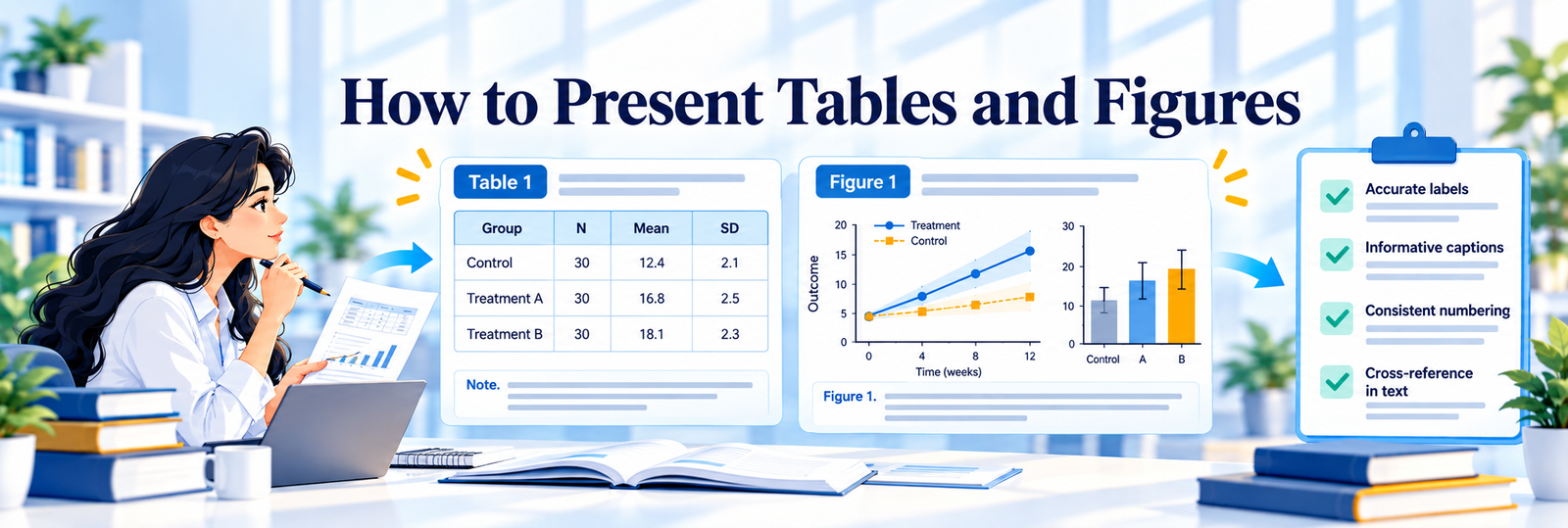
Tables and figures play an important role in communicating research findings. A well-designed table can present detailed numerical information efficiently, while an appropriate figure can reveal patterns, relationships or trends that may be difficult to identify from text alone.
In a PhD thesis, however, tables and figures should do more than make the document visually appealing. Each visual element should have a clear academic purpose, accurately represent the underlying evidence and contribute to the research argument. A table or figure should help the reader understand something important about the research. The precise requirements for numbering, titles, captions, placement and formatting vary across universities and disciplines. Therefore, institutional thesis guidelines should always be followed.
Why Tables and Figures Matter
A thesis may contain substantial amounts of quantitative or qualitative information. Presenting all of this information in paragraphs can make the research difficult to follow. Tables are particularly useful when the reader needs to examine exact values or compare several categories. Figures and charts are useful when the purpose is to communicate trends, patterns, distributions, relationships, comparisons, processes, conceptual structures and research frameworks. The choice should depend on the information being communicated rather than on visual preference.
Decide Whether a Table or Figure Is Necessary
Before creating a visual, ask: What does this table or figure communicate that the accompanying text cannot communicate as effectively? A table may not be required if a single sentence can present the information clearly. Tables and figures should be included selectively.
Choose the Appropriate Format
Different types of information require different forms of presentation. Tables are particularly appropriate for descriptive statistics, demographic characteristics, comparison of groups, regression results, reliability statistics, factor-loadings, correlation matrices, coding frameworks and literature characteristics.
Bar charts are useful for comparing discrete categories. Line charts are generally useful for showing change or trends across an ordered sequence, particularly time. Histograms can illustrate the distribution of continuous numerical data. Scatter plots can help communicate relationships between two quantitative variables. Box plots can provide a compact representation of distributions and potential outliers across groups.
Conceptual frameworks, research models and theoretical relationships may be presented as figures when a visual representation improves understanding. The selected format should reflect the nature of the data and the analytical purpose.
Use Tables for Precision
A table is often preferable when exact values matter. For example, a Results chapter may report mean, standard deviation, sample size, test statistic, degrees of freedom, confidence interval, p-value and effect size. Trying to communicate all of these values through a chart may reduce precision. A table allows the reader to inspect the evidence directly.
Use Figures to Show Patterns
Figures are particularly valuable when the overall pattern is more important than individual numerical values. A graph can help the reader identify upward or downward trends, differences among groups, clusters, associations, distributions and changes over time. However, a figure should not be used simply because the data are available. The visual should have a clear interpretive purpose.
Number Every Table and Figure
Tables and figures should normally be numbered systematically throughout the thesis. The exact numbering system should follow the university’s formatting requirements. If chapters are numbered independently, the numbering may follow the chapter structure. If continuous numbering is required, then that format should be applied consistently.
Write Informative Titles and Captions
A title should tell the reader what is being presented without requiring the surrounding paragraph to provide basic identification. Avoid vague titles. A more informative title would identify the content and context. The title should remain concise while providing sufficient information. Figures may require captions or notes to explain abbreviations, symbols, sources or other details.
Introduce Every Table and Figure in the Text
A table or figure should not appear without explanation. The surrounding text should tell the reader why it is being presented. The text can then highlight the most relevant observations. The reader should be told what is important about the results, not merely directed towards the table.
Do Not Duplicate the Entire Visual in the Text
The text and visual should complement one another. If a table contains ten variables and twenty values, repeating all of those values in the paragraph creates unnecessary duplication. Instead, highlight the principal pattern or finding. The table provides the detailed values; the text provides the interpretation.
Maintain Accuracy
Accuracy is more important than visual appearance. Check numerical values, decimal places, percentages, sample sizes, statistical values, labels, units, category names, axes, legends, confidence intervals and significance indicators. A figure that looks professional but contains an incorrect value can undermine the credibility of the thesis. The final version of each visual should be checked against the original statistical output or source data.
Label Axes and Units Clearly
Charts should provide sufficient information for independent interpretation. Where applicable, identify x-axis, y-axis, measurement units, categories, time periods and scales. Do not assume that the reader will infer the meaning of an axis. For example, a vertical axis labelled “value” may be inadequate if the reader needs to know whether the measure represents percentage, frequency, score or another unit.
Avoid Distorting the Data
Chart design can unintentionally exaggerate or minimise differences. Particular attention should be given to axis scaling, unequal intervals, truncated axes, inconsistent units, inappropriate three-dimensional effects and misleading proportions. The visual representation should reflect the underlying data rather than create an impression that is stronger than the evidence supports.
Use Consistent Formatting
A thesis should have a coherent visual system. Apply consistent formatting to table fonts, figure fonts, headings, numbering, captions, spacing, alignment, symbols, decimal places and abbreviations. Consistency becomes particularly important when a thesis contains several chapters and a large number of visuals.
Make Tables Readable
A table should contain enough information to be understood but should not become unnecessarily complicated. Consider concise column headings, logical ordering, appropriate decimal places, adequate spacing, meaningful grouping and explanatory notes where necessary. Avoid excessive borders, unnecessary shading or decorative formatting that does not improve comprehension. Large tables may sometimes be more appropriate in an appendix if the detailed information is necessary for transparency but not essential to the main argument.
Make Figures Accessible to the Reader
A figure should remain readable at the size at which it will appear in the final thesis. Check whether labels can be read, legends are understandable, text is not overcrowded, symbols are distinguishable, the figure remains clear when printed and the resolution is sufficient. A figure that looks acceptable on a large computer monitor may become difficult to read when inserted into a thesis page.
Use Statistical Tables Carefully
Statistical results require particular attention. Depending on the analysis, tables may include descriptive statistics, reliability coefficients, correlation coefficients, regression coefficients, test statistics, significance values, confidence intervals, effect sizes and model-fit measures. Do not include every item produced by the statistical software. Select the statistics that are relevant to the research question and required for transparent reporting. The reporting conventions of the relevant discipline should also be followed.
Distinguish Statistical Output from Thesis Tables
Statistical software output is not necessarily ready for direct insertion into a thesis. Raw output may contain redundant information, technical labels, unnecessary decimal places, excessive columns and software-specific formatting. The thesis table should present the relevant information in a reader-friendly academic format while retaining statistical accuracy. The underlying values should not be altered merely to improve appearance.
Present Qualitative Findings Appropriately
Tables and figures can also support qualitative research. These may be used to present themes, sub-themes, coding structures, participant characteristics, analytical categories and relationships among themes. However, a qualitative table should not reduce complex participant experiences to a set of numbers simply because a numerical presentation appears more convenient. If quotations are used, then appropriate participant identifiers and contextual information should be provided according to the study design and ethical requirements.
Include Sources Where Required
If a table or figure has been reproduced or adapted from another source, the source should be acknowledged according to the relevant referencing and copyright requirements. This applies particularly to published frameworks, previously developed models, maps, photographs, externally generated diagrams and adapted tables. The wording “Source: Author’s own compilation” should only be used when the visual genuinely represents the researcher’s own compilation or construction.
Refer to Tables and Figures Consistently
Use the correct designation throughout the thesis. Avoid inconsistent terms such as switching between “chart”, “graph”, “figure” and “diagram” when the thesis uses a formal numbering convention. If the institution requires all visual items to be classified as either tables or figures, follow that system consistently.
Check Cross-References Before Submission
Large theses frequently develop broken or incorrect references after editing. A final review should confirm that: every table mentioned in the text exists; every figure mentioned in the text exists; numbering is sequential; no table or figure is missing; captions match the actual content; cross-references point to the correct item; the List of Tables is accurate; and the List of Figures is accurate. Automatic cross-referencing tools can reduce errors in long documents.
Key Differences between Tables and Figures
| Purpose | Table | Figure/Chart |
|---|---|---|
| Exact numerical values | Strongly suitable | Usually less suitable |
| Category comparison | Suitable | Often suitable |
| Trends | Possible | Often suitable |
| Relationships | Possible | Often suitable |
| Detailed statistical results | Strongly suitable | Limited |
| Conceptual framework | Usually unsuitable | Suitable |
| Detailed information | Suitable with careful design | Often unsuitable |
| Visual pattern recognition | Limited | Strong |
The choice should always depend on the research question and communication purpose.
Common Problems to Avoid
Too Many Tables and Figures
More visuals do not necessarily make a thesis clearer. Excessive presentation can interrupt the research argument.
Decorative Charts
A visual without an analytical purpose adds clutter rather than value.
Repeating the Same Information
Presenting identical information in a paragraph, table and chart is usually unnecessary.
Unclear Titles
A reader should understand what the visual represents without guessing.
Missing Units
Numerical axes and measures should be clearly defined.
Inconsistent Numbering
Even a small numbering error can create problems in cross-references and the List of Tables or Figures.
Unreadable Figures
Small fonts, excessive information and low-resolution images can make an otherwise accurate figure ineffective.
Recommended Workflow
A reliable workflow is: Research analysis → Select information → Choose table/figure → Create visual → Verify against source data → Add title/caption → Introduce in text → Interpret key point → Check formatting → Cross-reference.
This sequence reduces the risk of designing visuals before the analytical purpose has been established.
Final Checklist
Before submitting the thesis, check that:
- Every table and figure has a clear purpose.
- The appropriate visual format has been selected.
- All tables and figures are numbered consistently.
- Titles and captions are informative.
- Every visual is introduced in the text.
- The text explains the important point rather than repeating the entire visual.
- Numerical values have been verified.
- Units and labels are clear.
- Statistical reporting is accurate.
- Sources are acknowledged where required.
- Formatting is consistent throughout the thesis.
- Figures remain readable at final size.
- Cross-references are correct.
- Lists of Tables and Figures are accurate.
- Unnecessary or repetitive visuals have been removed.
Conclusion
Tables and figures are part of the scholarly communication of a thesis. The most effective visual presentation is accurate, purposeful and easy to interpret. Tables should provide precision where detailed information matters, while figures should make meaningful patterns, relationships or structures easier to understand. The guiding principle should remain simple: Choose the visual that communicates the research most clearly, present the evidence accurately and explain why the visual matters. When tables and figures are integrated thoughtfully with the written argument, they strengthen the readability, transparency and scholarly presentation of the thesis.
No responses yet